Phase 4 · Final Report
The process of coaching a football team is complex. Through field studies involving interviews with players and athletics staff, observing high school football games, and observing videos of competitive events, we were able to derive the major components. These included artifacts like the playbook, the whiteboard, the armband, and film. The field studies also helped us to define stakeholders. These ranged from parents and members of the community to the coaches and players themselves. The latter two would prove to be the most influential which is why they ultimately became our clients.
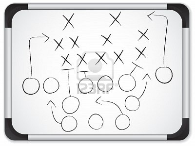
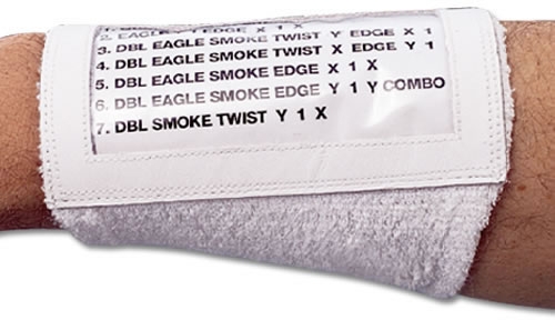
The problem we were trying to address was the efficiency of coaching. We conceptualized a digital model in which the aforementioned artifacts might come together to form a more efficient tool for coaches. Through discussions with stakeholders, primarily players and athletics staff, we decided that an application could be derived which included all of these tools.
The root concept was a digital playbook. This is an application which theoretically encapsulates all of these artifacts in a way that is easy to use and more effective than traditional methods. A digital model would allow portability, rapid distribution of ideas, and the convenience of having all of the major aspects of coaching in one place.
For the requirements analysis phase of this project, we needed some way to involve our stakeholders and observe the current situation. Two extensive interviews took place. One was with a football player from Eastern Montgomery High School. The other was a member of the Virginia Tech athletics staff. In addition, several games were observed at Blacksburg High School. Lastly, a video was studied which showed the Virginia State Championship between Eastern Montgomery High School and the Riverheads.
The most important findings from these studies were the derivation of artifacts and the emphasis on film. We knew that the activities provided by our solution needed to encapsulate the major artifacts utilized in coaching while placing a special emphasis on film. Film is utilized in a variety of ways by coaches. It is used to teach plays, highlight opponents, and analyze the performance of one's own team.
The activities supported by iCoach are activities that any coach should be familiar with, along with some new activities for the digital age. The software has the ability to create a play, complete with player icons, routes, and a color palette. The play can then be associated with a link to a video. Once a collection of plays has been established, they can be used to construct an armband. The armband differs somewhat from the usage in the current situation. It's more of a tool to deliver a few distinct plays for players to consider before the upcoming game.
In order to replace age-old traditional methods of coaching, the user interface for such a product needed to be easy to use. The transition from whiteboards and paper playbooks to a digital interface was a rather large step, so our product needed to replicate and enhance traditional methods as seamlessly as possible. For this reason, most of the activities were a direct mapping. Making a play in our system is very similar to making a play on a whiteboard. Metaphors needed to be strong and intuitive. This is why, for example, drawing the route of a player is as simple as moving one's finger along the desired path. This maps to the use of a marker on a whiteboard almost perfectly.
Additionally, there needed to be some benefit to switching to a digital system. This is why we created a method of distributing an armband to players over a network. If changes needed to be made for the upcoming game, a coach could simply distribute a collection of plays from the playbook on the fly. This, we felt, was a powerful tool in enhancing a coach's ability. Rather than being reliant on attendance at a team meeting, information could instead be sent out at a moment's notice. Once a team adopted this system, players would be “on the grid” in the sense that any studying or reviewing of plays would be updated with the most recent notes from the coach.
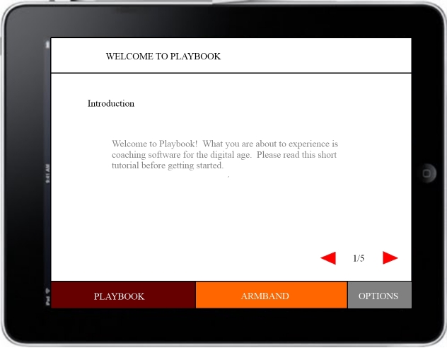
This enhancement is perhaps the aspect of our project which most blatantly deviates from traditional coaching methods. For this reason we felt that it would be extremely beneficial to include a tutorial upon opening the application. This tutorial is navigable through an interface involving left and right arrows with a label stating the current page and the total number of pages.
In terms of information, we didn't want to overwhelm or confuse our clients who had grown accustomed from years of tradition to the simplicity of whiteboards and playbooks. For this reason, we kept the interface as simple as possible while utilizing aspects of visual perception. Colors, for example, relate to tabs and topics in a way that makes it obvious what a screen is trying to accomplish. The playbook tab, for example, is maroon. When a user selects the playbook tab, the screen's color scheme is also maroon.
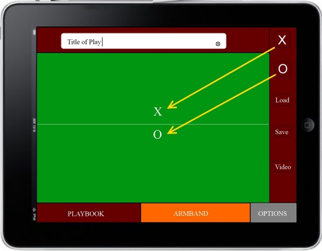
Another aspect of information we considered important was the depth of the application. We didn't want users to get so involved in a hierarchy of menus and submenus that they felt lost. For this reason, all aspects of the application are immediately accessible with one click no matter what task is currently being performed. In the midst of editing an armband, for example, the user can simply click the playbook tab to change views.
Once we'd established a prototype, we needed feedback and evaluation from our stakeholders. With the importance of transitioning from the tried-and-true paper method to our completely new system, we came up with a series of tasks along with an associated questionnaire. The tasks we asked the participants to perform were varied, but somewhat basic. First they were asked to perform was creating a play. After creating the play, they were asked to link a video from Youtube to the play. Lastly they were asked to distribute the play to members of the team.
Before completing this task, the participants were asked to rate their agreement on several questions related to their willingness to utilize our digital system. They also were granted an opportunity to leave comments after the tasks had been performed. For the most part, the response was good. However, there were a few issues that were concerning.
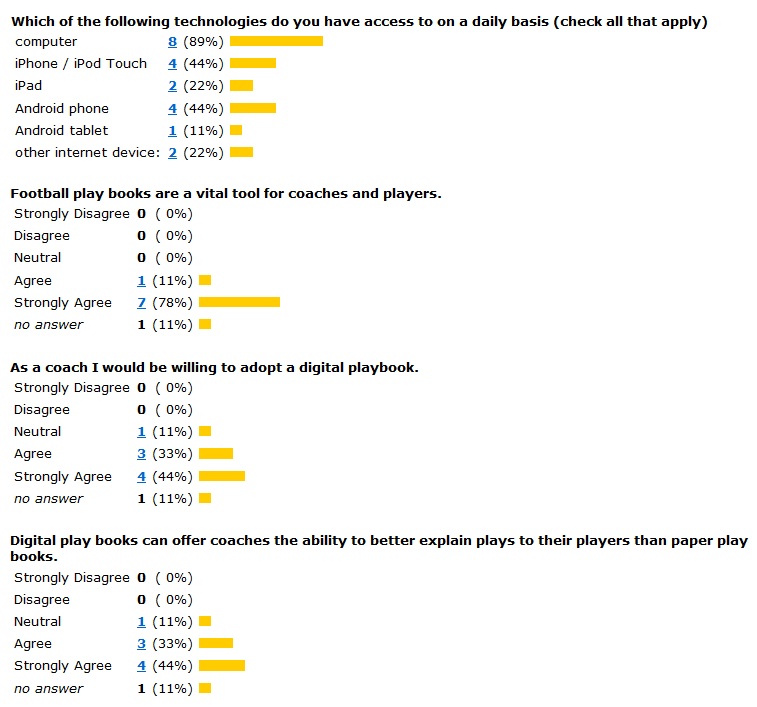
Participants expressed frustration on the aesthetic appeal of the prototype. Some of the colors were overwhelming or distracting. Others expressed frustration with navigating the interface. One user wrote, for example, “It's hard to get back to the home screen … I couldn't figure it out.” Another wrote, “there are some kinks that need to be ironed out, but the proposed functionality is good.” Our clients mentioned what they thought was an important oversight: the ability for the coach to leave notes on a particular play. This simple change would allow strategies to be better articulated for particular opponents. Even with the same play, the coach may have different notes depending on whom a team was facing.
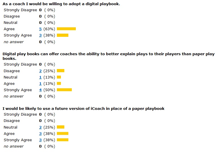
Statements like these were helpful for tweaking and redesigning the application. To solve the navigation problem, we implemented a home button along with the tabs on the bottom. We also modified the color scheme so that the interface is more aesthetically appealing. A section for notes was also included. These changes, while subtle, were brought to light simply by allowing review participants to express themselves. In the end they created a more complete software package.
The product isn't complete. Thus is the nature of software. It's easy to observe the current state of things and brainstorm countless improvements. The model, however, is something that we feel would be beneficial to coaches and players. Granted more time and resources, of course, we could produce something substantially more useful.
In terms of addressing the original problems, iCoach succeeds. The tools used in coaching are effectively encapsulated by the product. There are systems in place to support play creation, video association, and distribution to players. For this reason, the root concept is also reflected by the result. Certain aspects, such as storing the armband and distributing it through a network, weren't implemented due to time restraints.
In the real world, the current system might present some problems. It is web-based and requires a java-enabled browser to function properly. It can't be assumed that all coaches and players are technology savvy. The original design called for an iPad app, which might be easier for them to utilize. Overall the flow of the software and the low-depth, simplified design makes for a rather usable interface.
In terms of usefulness, there is much to be desired. The features which didn't make it to the final product, yet were in the root concept, are the reason it ends up being somewhat underwhelming. If the player distribution was implemented, this product would be far more useful. The original concept, however, we firmly believe would have been immensely useful in the real world.
Where the scenario-based design process is concerned, we followed it rather closely. Any deviation that occurred was a result of a lack of understanding. During task analysis, for example, we created an in-depth analysis of the process of reviewing a play on film. While it was interesting to derive such a dichotomy, it was essentially useless in the grand scheme of the project. We were likely supposed to apply this break-down to our design, but rather we simply kept it in mind while designing. We also created certain ideas on our own without necessarily relying on information from the client.
Aspects like scenario writing and claims analysis were useful in terms of brainstorming. They allowed us to gain insight in ways that might not have occurred had we performed traditional brainstorming. Regardless, the situations and outcomes are still wrought from our imagination. There is a certain degree of doubt on the effectiveness of a process which requires you to create your own pros and cons from imaginary scenarios. This particular process seems prone to bias and wishful thinking.
Rather than utilizing this process in a step-by-step manner, it's likely that we'd instead take key concepts from it. Given a design or usability engineering task at a place of employment, for example, we might make use of the field study tactics. Things like visual perception and Gestalt principles are almost second-nature. Sometimes a visual design just doesn't feel right, and relying on this instinct might move the process along more so than sitting down and making a list of qualities which do and do not align with certain philosophies on visual design.
What it boils down to is time management. Certain aspects of scenario-based design consume more time than they are worth. The final product might actually have been of higher quality if we used the time we had to design freely rather than devoting so much of our time to following protocols. Continued practice of scenario-based design might make the process itself take less time, and the final result as a result might be more fruitful.